Ekklesia 360 Logo
All branded advertising, documents, materials etc., must include the Ekklesia 360 logo.
There is a logo for light and dark backgrounds. If you are unsure which logo to use, please consult a member of the design team.
'e' Mark
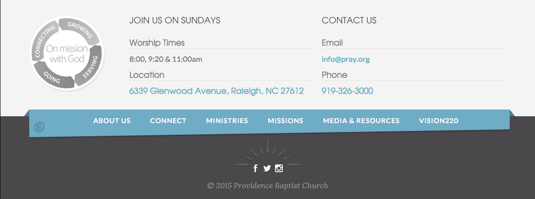
The Ekklesia 360 ‘e’ mark should only be used in site footers, or in special applications where the full logo will not fit.

- Reasoning behind the limited use of the ‘e’ mark is that we want to use our logo to create awareness and brand recognition. A Google search for “e” will not bring up results for Ekklesia 360, so until then, please use it sparingly.
- The ‘e’ mark should be sized between 10px - 18px.
Proper ‘e’ Mark Use In Site Footers
- The tag-line “powered by ‘e’” is OK, but not necessary.
- Please do not line up the ‘e’ mark with social media icons, rather, place it in a distinct location.
- The ‘e’ mark can be colored to match the website, but it’s rollover state should always be the proper Ekklesia 360 ‘e’ mark logo color.

Monochrome Black
The monochrome black logo should only be used as a last resort.
Appropriate examples of use:
- Printing Limitations
- Placed with other black logos
Monochrome White
The monochrome white logo should only be used as a last resort.
Appropriate examples of use:
- Printing Limitations
- Placed with other monochrome logos
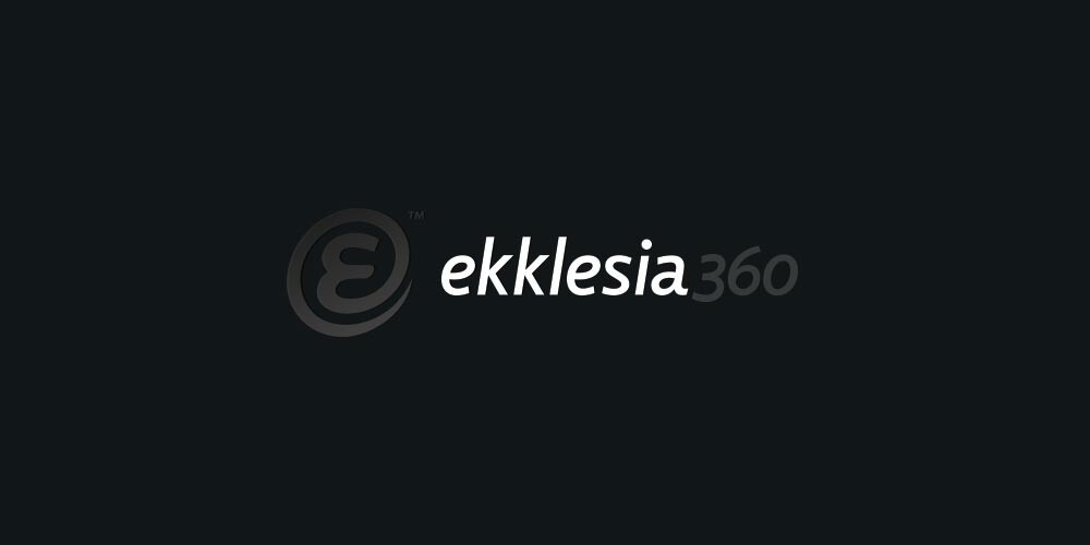
Proper Spacing
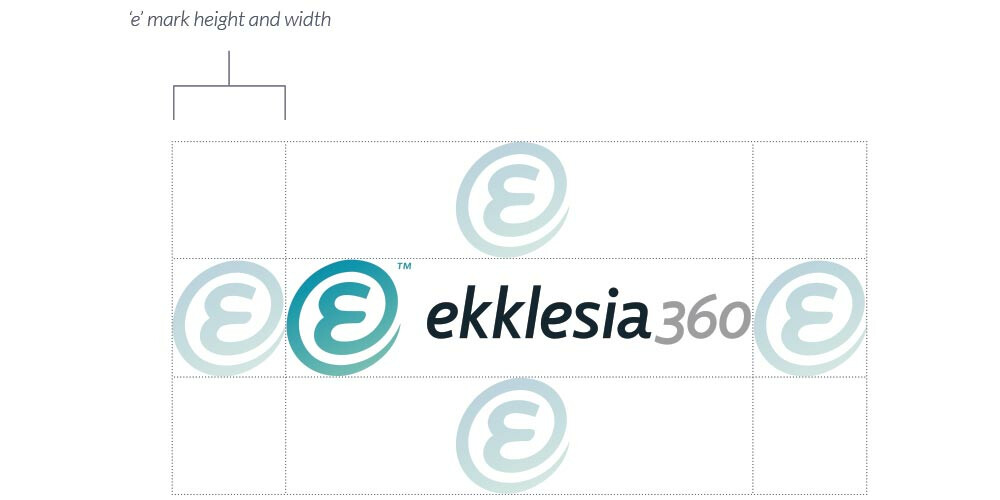
To ensure the Ekklesia 360 logo looks it’s best, we need to give it room to breathe. The height and width of the ‘e’ mark should remain free from all copy or design elements around the Ekklesia 360 logo. This same rule applies to the ‘e’ mark itself.
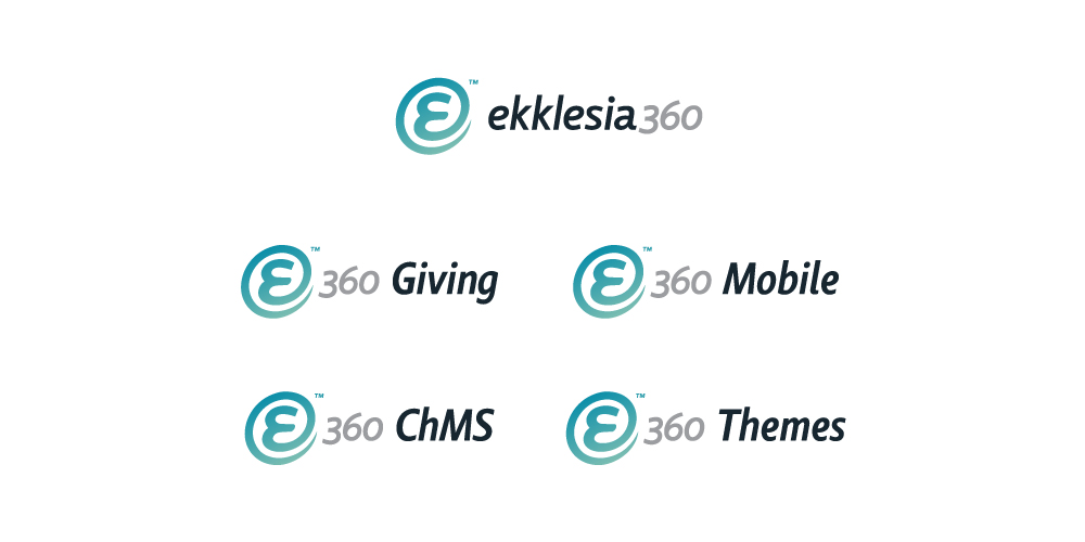
e360 Product Logos
- We have an ever-increasing number of Products that use the 'e360' logo style.
- Any new logo creation should be run past the Marketing and Design team.
- These logo's use the Ekklesia 360 branded 'e360' along with the same font (Comenia Sans Condensed).
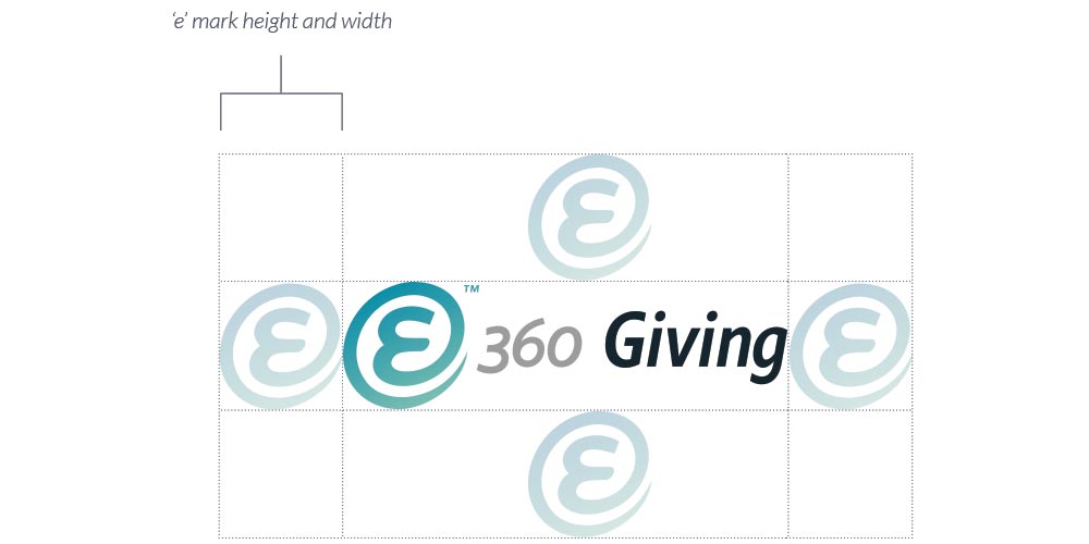
Please follow the spacing in the example:
- The space between the Ekklesia 360 logo and the added copy is 50% of the ‘e’ mark.
- Outer margin is equal to ‘e’ height & width.
Ekklesia 360 Service Logos
- Not all services require a logo. If you are unsure if a logo is necessary, please speak with the Marketing team.
- Any new logo creation should be run past the Marketing and Design team.
- These logo's use the Ekklesia 360 logo with uppercase Avenir Light text.
- The color of the service should be one of the Primary or Secondary Ekklesia 360 colors.
Please follow the spacing in the example:
- The space between the Ekklesia 360 logo and the added copy is 50% of the ‘e’ mark.
- Outer margin is equal to ‘e’ height & width.
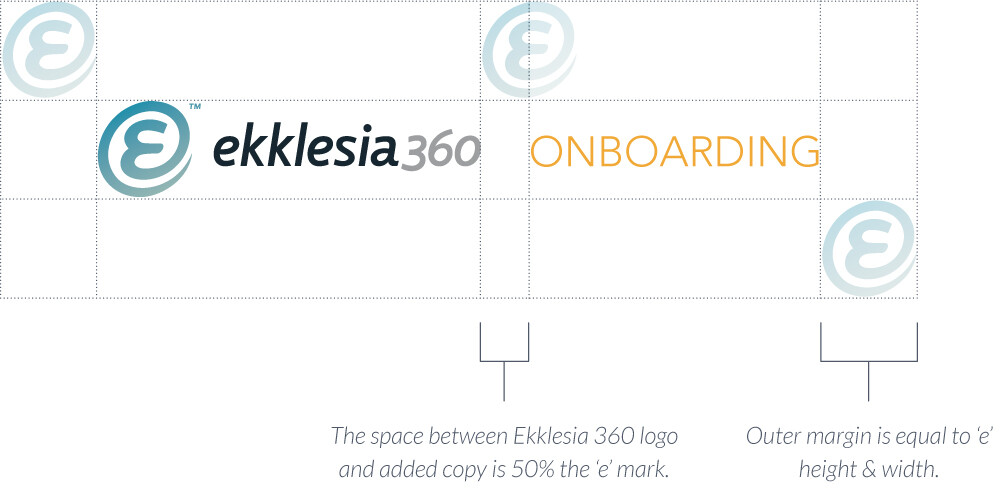
Logo Misuse
Please do not:
- Alter proportions, colors, or layout
- Place logos on images or colors that make it difficult to read
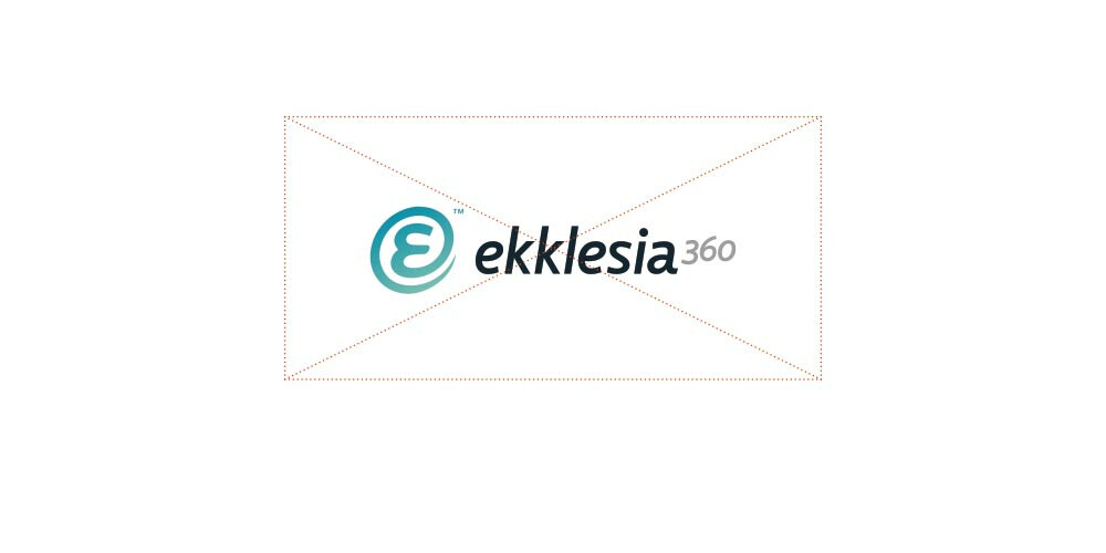
Do not change the logo proportions.
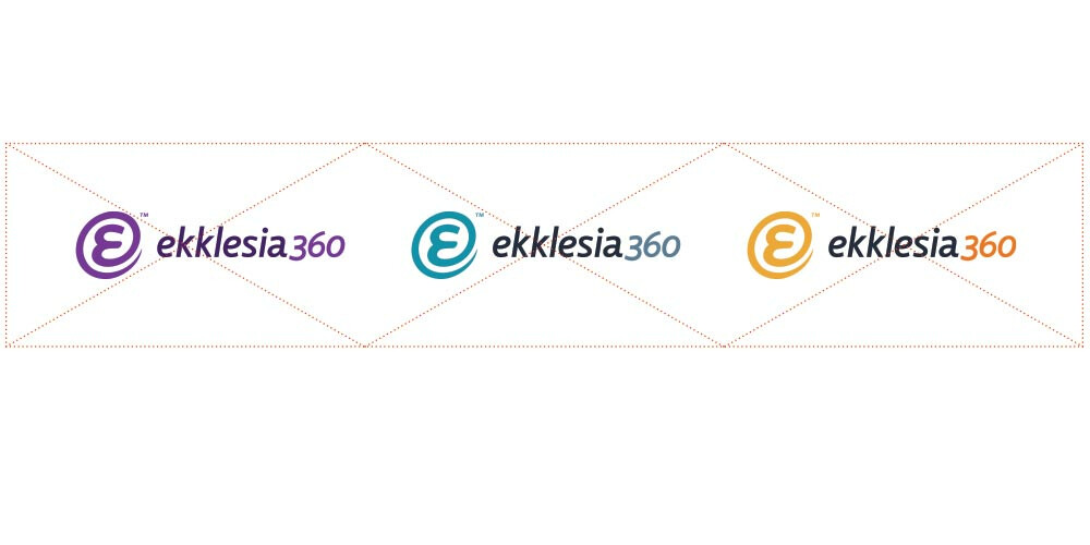
Do not change the logo colors.
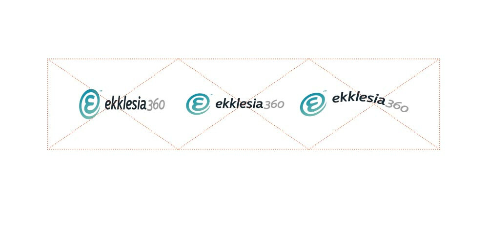
Do not skew, squish, stretch or warp the logo in any way.
Do not change logo layout.
Color Palette
- Here is a breakdown of the approved colors for all things Ekklesia 360. Note that there is a primary, secondary and neutral set of colors.
- Remember, less is more when working with color!
Primary

Ekklesia 360 Teal
HEX #1293aa
RGB 18 147 170
CMYK 81 26 28 1
PMS 7459 C

Gold
HEX #efa837
RGB 239 168 55
CMYK 5 37 90 0
PMS 143 C

Orange
HEX #eb7414
RGB 235 116 20
CMYK 4 66 100 0
PMS 158 C
Secondary

Periwinkle
HEX #5b7e95
RGB 91 126 149
CMYK 69 43 30 4
PMS 4515 C

Monk Mint
HEX #4da68c
RGB 77 166 140
CMYK 0 14 54 1
PMS 7723 C
Neutrals

Midnight
HEX #151921
RGB 21 25 33
CMYK 80 71 59 75
PMS Black 6 C

Night
HEX #262D3d
RGB 38 45 61
CMYK 83 73 51 53
PMS 7546 C

Dusk
HEX #505869
RGB 80 88 105
CMYK 72 60 42 22
PMS 7545 C

Light
HEX #f4f4f4
RGB 244 244 244
CMYK 3 2 2 0
PMS 663 C
Color Hierarchy
Here is a helpful guideline for how to use our approved Color Palette. When in doubt, Ekklesia 360 Teal and any of the Neutral colors are a great place to start. Add Monk Mint as a secondary, and use Gold as your “Call to Action” color.

Neutrals

Primary, Secondary, CTA
Color Misuse
Please do not:
- Introduce new colors outside the approved Color Palette (new colors in a photograph are OK).
- Set type on images or colors that are jarring or difficult to read (even if they are approved colors).
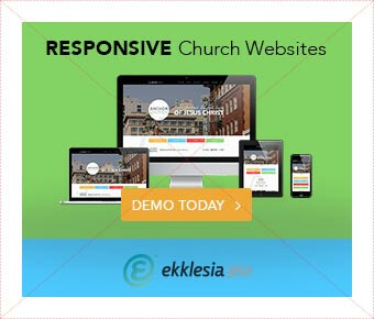
This design does not follow the approved color guidelines for Ekklesia 360 branding.
Fonts
Avenir Font Family
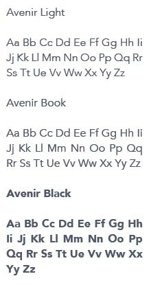
All branded materials will use the Avenir font family.
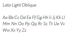
Lato Accent Font
This is the font found in the “Your Ministry Partner” tagline. Lato Light Oblique can be used sparingly for accent type.
Font Misuse
Please do not:
- Introduce fonts outside of the approved font families
- Stretch, squish, or distort fonts in any way
New fonts can be used on large scale projects like eBooks, but must be approved by design team.
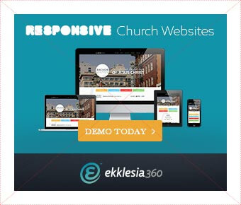
This design does not follow the approved font guidelines for Ekklesia 360 branding.
Icons
Elegant Font
Many times you will need to add icons to a design. The approved icon set is Elegant Font. This is the same icon font used on ekklesia360.com.
If you need to download these icons, you can do so here:
Elegant Font: 310 Of The Best Free Icons For The Modern Web
![]()
Arrows
There are a number of arrow icon options within the Elegant Font set. Please use the “caret” arrow icons.
![]()
![]()
Need an Icon?
You can now find additional icons at Orion Icon Library. We are strictly using the "solid" icon style to keep with our current branding. Design has the login, so let us know what you need and we can download/size it for you. If you just can’t find an icon you need. Let the design team know and we will custom make one for you!
![]()
Buttons
Button styles need to match the feel of the site buttons. Rounded corners, and bold text. The color of the buttons can be any color from the Ekklesia 360 color palette. Typically, white text is used on the bold colored buttons.
Ekklesia 360 Site Button Styles
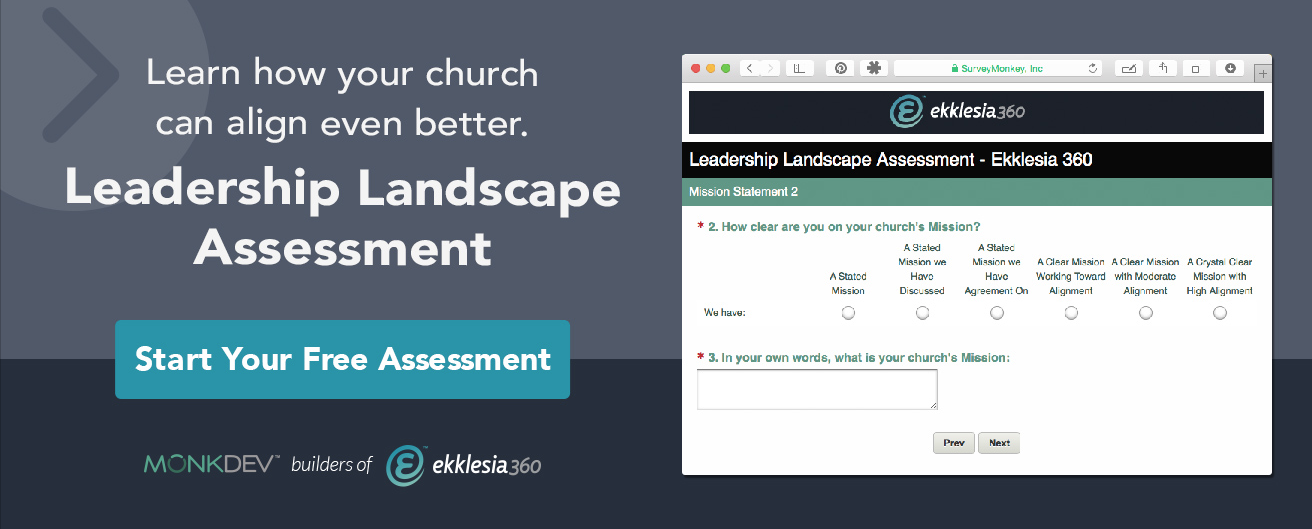
Example of a teal button.

Example of a gold button.
Have a design question?
Fear Not
The Design Team is here to serve you. Feel free to talk to a member of the Design Team, show us what you’re working on or ask as a question.
